Monday, December 14, 2009

Do it Yourself

In the March 2009 edition of ELLE magazine, four alternative covers were featured, each designed by a different designer. Vivienne Westwood, John Galliano, Christopher Kane and Stella McCartney all designed covers to celebrate the 25th anniversary for London Fashion Week. Each design in unique, each reflecting its designer. The designs are very inspiring, each with their own individual style, something I wish to achieve throughout my career as a designer that I will be able to display within all aspects of my work.

The first was designed by Vivienne Westwood, who when asked about the inspiration for her design suggested "In these hard times - Dress up. Do it Yourself!".

This cover was designed by John Galliano and supports British fashion. Galliano was quoted "Rule Britannia and long live British fashion! Here's to 25 years of London Fashion week, 25 years of Galliano and 25 years of changing the way we look! Here anything is possible, anything goes. Be bold, be fearless - be a true Brit!".

Christopher Kane used Polaroids taken before his S/S 2009 fashion show, which symbolised the end of the design process, captured the memories of show nerves and the transformation for the clothes.

Stella McCartney used her Comic Relief t-shirt designs as a basis for her cover. This cover not only raises awareness of Comic Relief and Red Nose Day but also shows fashion and its role and strength in ending poverty. The t-shirts provided jobs in Africa and were organic and Fairtrade.

All images are taken from my camera, and are of ELLE 2009.

Tuesday, December 08, 2009

Design Development

Below is a selection of some work from a Design Development project. This was the first time I'd really attempted to draw fashion illustrations and to create fully readable flat drawings of a final capsule collection. As a reminder, at the beginning of term the class was put into groups and researched into a designer's brand, customer, and style and researched into trends. Our designer was Martin Margiela. Once the research element was complete we then designed individually. First I am showing four pages of design development where I work through each garment, altering style features developing them to make a collection that will work together but also a range of garment styles within this. I started my design process by writing a list of the areas I wanted to design in and what percentage these would take up in my design development.


I started with jacket shapes and styles, looking at past examples in collections and thinking about how they could be structured.


I then looked at trousers and shirts, creating a formal aspect in my designs, but there were also casual jersey items, leather jackets and trousers.


Below are two flat boards. I scanned in my design development flats of the ones i was using in my capsule collection and traced over them in illustrator. I tried to make them as clear as possible and easy to read.


I stuck squares of fabric samples to the board displaying not only the fabric that would make up each design, but also the colour.


My illustration pages were next drawn up. I'd practiced some styles of figures in my development and practiced drawing on my garments. I then tried different ways to color them and chose this style.
I used this background and layout as Margiela is known for his simplistic style, as you can see from his website.


Images are of my own work.

Wednesday, December 02, 2009

Homemade

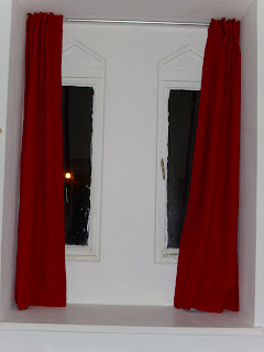
This year, my boyfriend and I live in a flat in an old Gothic building. With period features including archways, large beautifully designed windows and high ceilings, it was hard not to fall in love with the place. After living here for a few weeks we found that because our bedroom window was quite big and the curtains provided were rather thin, quite a lot of light was let into our room sometimes making it difficult to sleep. The solution to this was to get new curtains.

New, thick curtains made to the size of our window, however, was looking to be quite expensive, which is something us students don't like. So an idea was born, why not make our own curtains? We ventured into Samuel Taylor's, a fabric shop in Leeds city centre, to see what fabrics we could use. We got a few metres of thick red cotton, to match some drapes over the bed; curtain blackout and some white cotton to line them. This is total came to £44, which was half the price of some of the curtains we'd seen (to be honest we bought too much fabric but it might come in handy in future!).

Over the next few evenings we began planning the final look of the curtains including how long they'd need to be and how we'd hang them on the rail. We cut out all the layers for each curtain, with seam and hem allowances and I got to work on my sewing machine. First i stitched the blackout to the lining to hold it in place, then I stitched the main red cotton to this, concealing all raw edges. A top edge was then added to the curtains, which is where some tabs are concealed so that the pole can be slotted through them and be hidden behind the curtain. This also meant that no light could come through above, below or around the curtains. It was a long process, mainly because I'm a perfectionist and wanted a professional finish, but it was really worth it! The curtains add a personal touch to our flat, making it feel even more homely than before.


Images from my camera

Monday, November 30, 2009

Tell me your secrets...

"In November 2004, I printed 3,000 postcards inviting people to share a secret with me: something that was true, something they had never told anyone. I handed out these cards at subway stations, I left them in art galleries, and I slipped them between the pages of library books. Then, slowly, the secrets began to find their way to my mailbox.
After several weeks i stopped passing out postcards but secrets kept coming. Homemade postcards made from cardboard, old photographs, wedding invitations, and other personal items carefully decorated arrived from all over the world. Some of the secrets were written in Portuguese, French, German, Hebrew and even Braille."

This is the beginning of the introduction to the PostSecret book. This book is just one of many books produced by "accidental artist" Frank Warren. 5 years ago, he invited others to share their deepest, darkest secrets with him. He encouraged those who were hiding something to speak out, but he allowed them to do this anonymously. From all over the world, people send Frank postcards containing their secrets, he is then welcome to read them, post them on his
blog, or even get them published into his books. Frank gives people an outlet for their hopes, fears, confessions and memories (whether happy or painful) and allows them to share them with the whole world.

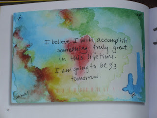
I haven't sent in a secret yet but every week, after Sunday, I go to the blog and I read each secret for that week. Sometimes I can relate to them, and this is what most followers of PostSecret like about it as it can make them feel less alone with their secrets. What I love about PostSecret is how everyone is invited to post in their secrets, regardless of religion, age or race; and also the design element of the postcards. Every postcard is unique, and is normally designed with the secret in mind. People draw, print, type, write, collage, paint on their postcards, they're given the freedom to tell their secret exactly how they want to, visually or with words. Sometimes postcards are hidden inside an envelope, this shows they want to share their secret but they're not quite ready to, this can give someone peace of mind just as much as sharing their secret. People have proposed, confessed their love and thanked friends and family all through this website and the books. Below are some examples of the secrets in the book and visit http://postsecret.blogspot.com/ for more secrets and information.


Quote and images are taken from the PostSecret book by Frank Warren. All images are from my camera.

Thursday, November 26, 2009

The Fashion Book

The Fashion Book is fashion's equivalent to the Art Book. I bought this book at the end of the summer and it's like my little fashion dictionary. It's small, compact and concise. The book features designers (fashion and textiles), illustrators, photographers, models and icons from the past 150 years and is really inspirational. I decided to invest in this book after choosing to study the 20th Century Fashion. Below are some photographs from the book showing layout. Each page features a different person, has a photograph showing an aspect of their work and includes information about them and where they fit into the fashion world. The list of designers and icons is in alphabetical order, which not only makes it easier to find information on a specific person but can also create juxtapositions between the creators and their work. The book includes quotes and gives a short biography, sometimes with information you might not have found elsewhere. For example in the entry about Stella McCartney the book claims "on Friday and Saturday mornings McCartney would garner antique buttons and vintage clothes, which explains the romantic strand of her style". I'd recommend this book for all with an interest in fashion.

Below are some photographs of some of the pages in the book including Stella McCartney, Kate Moss, Paul Smith, Thierry Mugler and Willi Smith.

Photographs are from my camera of The Fashion Book, Phaidon Press, 1998.

Tuesday, November 24, 2009

Wood and Textiles

When I did art at A level, I didn't paint and draw like most people, I used sewing machines, silks, feathers, beads, threads and calico and tested and played around until I was happy with an idea. I would then develop this idea and create a final piece on this. Ever since doing this I have always been very interested in this style of textiles art. When we were given full access to WGSN at the start of this university year I planned on reading it more and gaining more knowledge about the industry I am in.

One of the first articles I read about was Wood Threads inspiration, techniques and application. Ella Robinson's Wood Textiles exhibition has inspired those as WGSN for different elements in forthcoming trends. Her work can be seen here and shows her work in different galleries. I found her work inspiring as she used both natural pieces of wood, mostly driftwood on the beach, but she also used mass produced blocks of wood. The driftwood helped her to create completely unique pieces whereas the mass produced wood gave her work a different style and could give more regular patterning. The wood is drilled and treads are wound around and through the wood to create stripes, patterns and pictures. Her work is quoted to be:
"Inspired by the bright and bold colours of urban environment - graffiti and street art for instance - alongside the calm and tranquillity of the British coastline, the resulting collection of objects is beautiful and precious."

Below are some examples of her work:


Images and quote from http://0-www.wgsn.com.wam.leeds.ac.uk/members/materials/features/mt2009sep29_089162.

Monday, November 23, 2009

UP! Up and Away!

As a child I fondly remember watching Disney videos over and over again. The films created by Disney allowed me to live in a world of happily ever afters, princesses and talking animals. I have always been a fan of Disney films with Aladdin, Beauty and the Beast, Cinderella and Bambi just to name a few!


However my most favourite of their films are those where they have teamed up with Pixar. Right from the beginning when they bought toys to life in Toy Story, I have been a fan of the animations created by Pixar. I remember a few years ago, before i chose to go into fashion, I wanted to work for Pixar to help create characters like those found in Finding Nemo. The development of how the characters will look, then moulding them into 3D and finally animating them, sounded fun interesting and very creative. Watching the extra features on the DVD's to see how the design process is followed was fascinating and gave backgrounds to the characters and the films themselves.


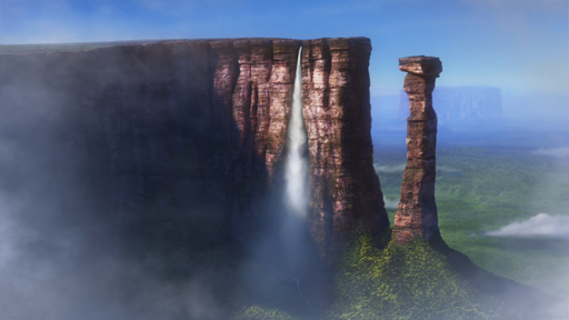
I remember reading in the paper about their latest film UP! in which an old man ties thousands of balloons to his house to escape his daily regime and see other parts of the world, in this case South America. He later realises he has an 8 year old boy on his porch as he is sailing through the air. The film tells the story of their travels and how they can work together as a team to overcome the difficulties they find on their way. The fantasy land created in this film was influenced by a video documentary of Venezuela by Adrian Warren. The creators of the film travels to various places including Canaima National Park to give them inspiration for the beautiful scenery they wanted to portray in the film.


Image courtesy of http://science4grownups.com/archives/2009/05/29/general/the-real-world-behind-ups-paradise-falls-530

Time to Grow

For my Digital Design Module, part of our first project is to research into themes and trends, a target market and a garment type and style, and to create a seasonal colour palette. A collection will then be developed and produced from this research in a second project. As a first step, I decided on my season, which is Spring/Summer 2010, and that I wanted to design this collection for Menswear. I then started to look into predicted colourways available to be on the trend site WGSN. This website is really useful and covers all parts of the predicted trends. So I wanted to use this for my own research in developing my own theme. I approached the project in a similar way to my Design Development modules I've had so far here at university.
I then chose a trend and researched further into it. At first i based this on colour, as I'd be developing my own colour palette from this and this trend had a wide range of colours.
The more I looked into this trend the more inspired I became. I began seeing more of a meaning and more of a mood and started thinking of my own trend I could develop from this. I began to look around me and realised we were given this project at the most perfect time, the turning of Autumn. The colours and idea of the seasons evolving was a perfect theme for my own collection.
Here are some of the predicted shapes for this trend.

Here are some predicted patterns for this trend.
I decided to name my theme "Growth". This was linked to the season I'd chosen to design for, as Spring is when the leaves start to grow on the trees, when animals give birth to their offspring and the days begin to get longer and warmer. This was also based on evolution and how things change and develop over time. My colour palette reflects some of the early colours predicted as well as some seen in Autumn. I tried to draw colours from pictures used as inspiration for my theme.
Below is one of my favourite pages. I felt there was limited time on this project and I needed to research into my target audience. I began to think who to aim the collection towards and decided young males who were interested in fashion and socialising. I realised I had the perfect friend for this part who could be used to define my target audience. I developed a page, with his permission, and I literally just wrote about him. I wrote about his likes, dislikes, where he shopped, what he did in his spare time and even his favourite type of music. This page allowed me to get a really good understanding of who I would aim my collection towards.
I then decided to refine my collection to trousers. There had been many different trouser shapes predicted for this season and i could see some natural forms that had inspired these shapes.
The collection is currently being produced using the colour palette I developed for the theme Growth and the predicted shapes patterns used within the researched trend.

Images are of my own work.

Tuesday, November 17, 2009

Menswear Trends Autumn/Winter 2010/2011

Here are some of the trends that have been predicted for Autumn Winter 2010/2011. These have been chosen because they are somehow linked to the Maison Martin Margiela brand and the collection I am designing for this project will be influenced by a mix of some of these trends. The trends have been analysed to show links between the elements of the trend and the brand. This could be on colour, keywords, predicted shapes or the fabrics within the trend.


All images are of my own work compiled from www.maisonmartinmargiela.com and WGSN.com

Monday, November 16, 2009

Inspiration for my Maison Martin Margiela Designs

Below shows images of the customer board, mood board and fabric board that will help to inspire my design work for this project. These will be used throughout the whole design process and have been developed through out research into the Maison Martin Margiela brand, customer and collections.

Customer Board
Mood Board

Fabric Board
All images from my own camera

Wednesday, November 11, 2009

TV Heaven!

At the weekend I visited the National Media Museum in Bradford. This was only a short drive away from Leeds and had some interesting exhibitions of photography and animation. The photography exhibition displays the work of Neeta Madahar, who gained the Bradford Fellowship in Photography award. Her works consists of both photography and video. This was quite interesting to see her work as she has studied a variety of subjects covering the artificial and natural world.


Drawings that Move: the Art of Joanna Quinn showcases the "highly individual approach to art and the business of animation". The work is found in sketchbooks, comic strips, character drawings and videos of her work. The exhibition demonstrates where she found her inspiration, who helped her with some of her characters and films and also showed the awards she has been given for her animations. She is well known for films such as Girls Night Out (1986), Britannia (1993), Dreams and Desires (1986). She has worked not only in film, but also in advertising, such as the Charmin toilet roll adverts.

The rest of the museum has different area for all ages, there is the Kodak Gallery, The IMAX Cinema, Experience TV & TV Heaven floor, the Magic Factory, the Animation Gallery, the Profiles Gallery and the On Location and Action Zones. The most interesting floors were the Experience TV & TV Heaven, the Magic Factory and the Animation Gallery.

The Experience TV & TV Heaven floor gave an insight to radio stations, advertising, news and television production. With its very own "blue screen" it allows you to see how backgrounds are created for the weather broadcasts and films. You can produce your very own news broadcast you can be a cameraman for a television show. The Magic Factory helps people of all ages learn how light behaves and the Animation Gallery looks at the different types of animation, such as Wallace and Gromit; and the Simpsons. You can see 3D characters from films and cartoons and look at how animations have changed over the years.

If you're planning on viewing this museum I'd recommend you spend the whole day there, there is so much to see and do, it's very interesting for everyone and all the exhibitions are free!


Images are from my camera, including those of the map of the museum and a postcard from one of the exhibitions.


Related Posts with Thumbnails